Challenge:
Create a brand identity for a new modern tapas restaurant in Miami that blends Japanese and Spanish culinary flavors and creates an iconic identity that communicates the style and personality of chef/owner Josh Elliot.
Approach
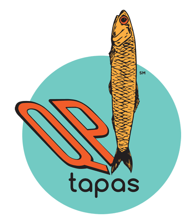
- Explored etymology of "QP" (referencing the classic Japanese condiment Kewpie ) and the classic Spanish ingredient, the anchovy, to inform brand story
- Developed a bold visual system combining modern minimalism with cultural elements
- Created cohesive identity that works across dining experience touchpoints
Solution
Visual Identity
- Logo merges fish motif with "QP" letterforms and the iconic “red” circle from the Japanese flag with the pop colors of pop spanish art
- Color palette: turquoise, coral, magenta on warm backgrounds
- Custom typography system balancing modern and traditional elements
- Playful anchovy illustrations as recurring brand element
Environmental Design
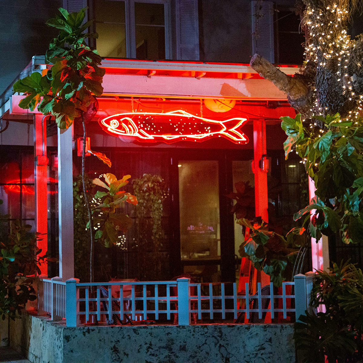
- Neon fish signage as signature interior element
- Strategic lighting to create intimate dining zones
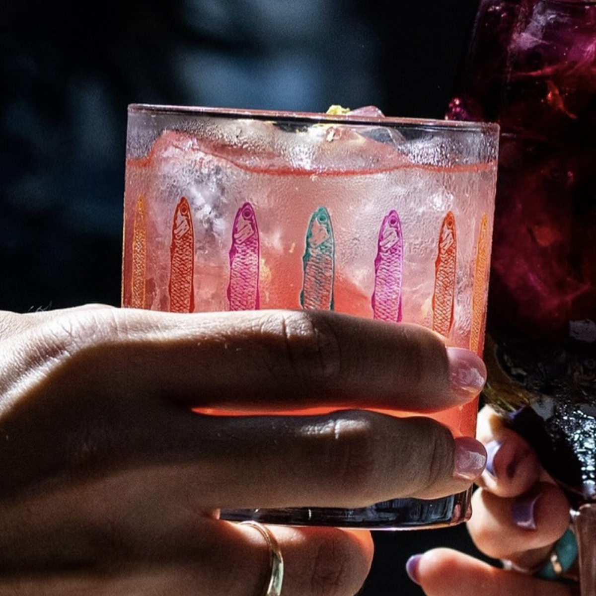
- Custom glassware featuring fish pattern wraps
Menu Design
- Clean typographic hierarchy
- Bilingual descriptions with ingredient focus
- Custom illustrations
Brand Story
- Name references both Kewpie (Japanese mayonnaise) and Quota Pars (Latin for "shared portion")
- Tagline "Quality People. Quality Products." emphasizes commitment to authenticity
- Brand voice balances educational and approachable tones
- Visual storytelling through menu descriptions and environmental graphics
Results
- Successfully launched restaurant concept
- Strong visual recognition in competitive market
- Cohesive experience from branding to plating
- Effective communication of fusion concept while maintaining authenticity